Here’s a real world demonstration of why I’m always saying please don’t reverse out of white.
Now what do I mean by that phrase “reverse out of white”? Well it’s a popular method that graphic artists use to make advertisements look good. It’s where a solid block of colour looks as though the copy has been printed in white ink. It hasn’t been… the print has been effectively reversed out of the block of colour.
Now, as I’ve said, artists love to do it because it looks good when you’re looking at the perfect original art work but unfortunately it doesn’t come up so well in print.
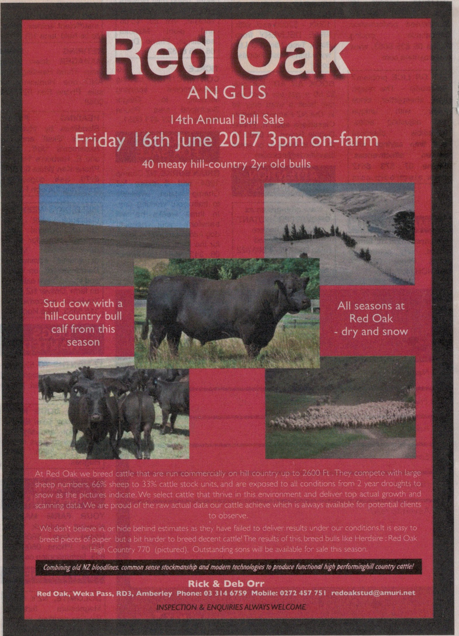
I took this advert out of a farming journal in New Zealand which was an ideal publication for the couple to promote their Angus bull sale.
The advert ran about a week before the sale was to take place but as you can see it’s very difficult to read the white print which, no doubt, spells out why people should travel to the sale and buy a little bit of bull.
Download Winston’s fantastic “How to write a great advertisement”
for just $40. Get it now.
If you saw the advert as published, you would understand that regrettably very few people would be able to read it. So, unless the vendors had some other method of promoting their sale (maybe a database of previous sale attendees) their sale might not have done as well as they eagerly anticipated. I reckon they thought they had a fantastic advert which looked great and would really get the attention of buyers. The shame is that, although they may have got the attention of prospects, they might not have been able to read the information to convince them to attend the sale to purchase.
The rule is pretty simple… almost always it’s best to avoid reversing out of white! Instead use a dark font on a light background. That’s if you want the advertisement to get read.
Recent Comments